
Compliant Content
CONTENT
- Use the simplest language appropriate for your content.
- Make links descriptive. Don’t use “click here”, “Here”, “More”, “More Information”, “Continue”.
- Bad example: Click here for a list of benefit plan contact information.
- Good example: We’ve provided a list of benefit plan contact information.
- Generally, do not have links open in new a new window or tab. It’s difficult for disabled users to get back to the page.
- Check spelling, grammar, and readability.
- Be careful with abbreviations, jargon, complex language, or anything that might confuse the reader.
- AVOID THE USE OF ALL CAPS. IT CAN BE DIFFICULT TO READ.
- Do not use descriptions that rely only on sight (e.g., “click on the square”, “the box on the left side of the page”, “The big blue text”).
- Don’t use URL’s as link text, unless the document is intended to be printed or if the URL is relevant content.
- If you use SurveyMonkey for surveys, follow their guidelines.
- You may wish to download a copy of JAWS, a screenreader that may be used by our consumers. It’s interesting and a learning experience to hear what is read and will be educational for all. You may need to reach out to the help desk for this.
HEADINGS
Use headings correctly. To apply headings, look in the icon toolbar at the top and click on “Formats.” Simply click, and choose the heading you want in the dropdown menu.
The name of the page should be an <h1>. Typically this is a hidden area of the page, so the title of your page should begin with <h2>. This way, headings are sequential which makes it easier for assistive technology to understand the web page.
Note that the bigger the number in the heading, the smaller the text. Headings are pre-set for you using style sheets developed and maintained by IT. Please do not add code to make headings look different (i.e., add red, make bold, etc).
IMAGES
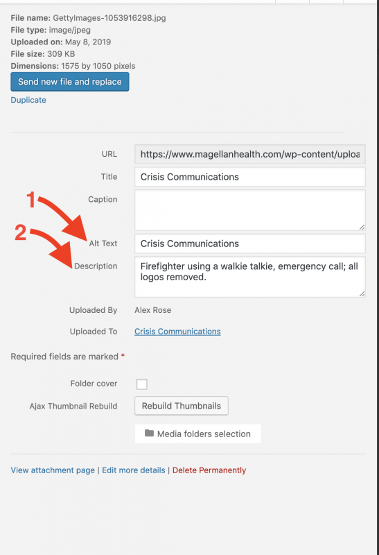
All images must have an alternate (alt) tag. (See Item 1 in the picture below)
Alternative text serves several functions:
- It is read by screen readers in place of images allowing the content and function of the image to be accessible to those with visual or certain cognitive disabilities.
- It is displayed in place of the image in browsers if the image file is not loaded or when the user has chosen not to view images.
- It provides a semantic meaning and description to images which can be read by search engines or be used to later determine the content of the image from page context alone.
When you create your image in Media, simply add a descriptive name of what the image is (for example, “Magellan Provider Satisfaction Survey”) in the “alt tag” section of media when you’re creating your image and also when you’re linking to the image (if it’s not there already).
Images should not be used to convey text.
Remember that the alt text must be descriptive and should not say only things like “image”.
A long description is a way to provide long alternative text for non-text elements, such as images. Generally, alternative text exceeding 250 characters, which cannot be made more concise without making it less descriptive or meaningful, should have a long description. (See Item 2 in the picture below)
COLOR
Color cannot be used as the only visual means of conveying information, indicating an action, prompting a response, or distinguishing a visual element. This includes images. You can use the WebAim Color Contrast Checker to verify your colors.
Images: includes infographics, charts, photos, illustrations. Whoever obtains or creates images for the site should consider color contrast. Example: users might not understand a pie chart where only color separates the segments. In this case, you should add clear labeling and patterns to the segments.
Make sure that color contrast is strong, especially between text and background. This is true for images that include text as well.
Insufficient
Borderline
Sufficient 
Text: The use of color can enhance comprehension, but do not use color alone to convey information (e.g., “Items in red are due this week”). Using color is fine (e.g., “The items due this week have the red word ‘due’ next to them”), it just can’t be the only way information is provided. Also, do not change color for text or check with the IT team if it’s needed.
Links: Do not change color for text or check with the IT team if it’s needed. Link color is managed by the template. If you change the text color for some text that includes a link, you could interfere with the contrast ratio.
Guidelines Summary
- Do not have the video play automatically when the page loads.
- Need a method to stop, pause, mute, or adjust volume for audio that automatically plays on a page for more than 3 seconds. Youtube will provide this capability.
- Non Live
- Audio-only and Video-only (1.2.1)
- Audio: A descriptive text transcript (including all relevant visual and auditory clues and indicators) is provided (audio podcasts, MP3 files, etc.)
- Video, no audio: A text or audio description is provided (e.g., video that has no audio track).
- Video with Audio
- Captions – Provide captions for videos with audio (1.2.2)
- Text Transcript – A descriptive text transcript OR audio description (see below) is provided for web-based video. Transcripts should include all information present in the audio or video such as visual cues (for example, ‘The fisherman holds up a large bass.’) as well as dialogue attribution and description. (1.2.3)
- Audio Description – NOTE: Only required if the video conveys content visually that is not available in the default audio track. An audio description (recorded voice description) is provided for web-based video (1.2.5)
- Audio-only and Video-only (1.2.1)
- Live
- Video – Synchronized captions are provided for all live multimedia that contain audio (audio-only broadcasts, webcasts, video conferences, etc.) (1.2.4)
Video: Non-live with audio track
What to do
- Upload your videos to a Youtube account (do not use another video service). Check with the marketing team for an existing YouTube channel to store your videos. You will need access to add captions. See also our video upload for general instructions.
- Add captions
- Add a descriptive text transcript OR audio description
- Webinars: use Zoom for prerecorded events (non-live), place on Youtube, add captions.
Captions
You will need to add synchronized captions to videos with sound. Captions detail at WebAim.
How? Watch the first video. If you want more detail, watch the second video. Click the title in the video to make it larger.
Infographics
Guidelines
- Provide a short or long text alternative (there is another option that requires a web developer).
- Short: if less than 10-15 words, use alternate (alt) tag.
- Long: if more than 10-15 words, use long text alternative. See below. Example of long text alternative infographic.
- Ensure minimum contrast ratio between the text and graphics. The contrast ratio must be at least 4.5:1 for normal text or 3:1 for large text. Please consult with Coleen Sallot for direction.
- If you use color to convey information within an infographic, make sure the same information is communicated either in text or via other visual cues such as text formatting or font size.
Long Text Alternative
Place the long text alternative either on the same page as the infographic or provide a link to the text alternative located on a separate page.
On the page benefit: users remain on the same page, which requires fewer clicks to navigate to a new page and perhaps back again to the original page.
Creating a text alternative for an infographic
- Create a text alternative that presents the same information that is in the infographic. Things to consider:
- Purpose: Determine what parts of the infographic need to be explained in text form.
- Hierarchy: Group the text into logical parts that follow the order presented visually by the infographic.
- Meaningful images: Ensure that any context provided by visual cues in the infographic is included as alt text if it is pertinent to the information that is being communicated.
- Decide whether to include the text alternative on the same page as the infographic or on a separate page. Provide a link before the infographic to the text alternative with meaningful link text such as “text alternative for web accessibility infographic“. If the text alternative is on the same page, then the link will be a jump link otherwise it will link out to the page that the text alternative is on.
- Before the text alternative, include a heading for the text alternative, such as ‘Text alternative’