
Lorem ipsum dolor sit amet, consectetur adipiscing elit, sed do eiusmod tempor incididunt ut labore et dolore magna aliqua. Ut enim ad minim veniam, quis nostrud exercitation ullamco laboris nisi ut aliquip ex ea commodo consequat. Duis aute irure dolor in reprehenderit in voluptate velit esse cillum dolore eu fugiat nulla pariatur. Excepteur sint occaecat cupidatat non proident, sunt in culpa qui officia deserunt mollit anim id est laborum.
Picking Images For WordPress
There are several different ways to add an image to your page. Below is a guide to how to choose the right image for each module. For all modules, remember to follow these rules:
- Web resolution – make sure that your images are saved for web. Print files are much larger and take longer to load, slowing your website and affecting performance
- Image size – Pixel dimensions are generally not important compared to image shape and the content within the picture as in most cases the image will either automatically resize to fit the module or can be manually adjusted by you once you have uploaded them. HOWEVER, it is important to understand how WordPress will handle your images. Read the guide below to understand these differences. When planning new content it is best practice to consult with Creative Services and ensure that they know what you intend to use the image for.
- Pre-formatted modules – several of the modules listed below will resize images based on the size of the screen below. This means that looking at the pixel size of an existing image is not always a good guide to the image’s actual size. For the most part, these modules work well with a big range of image sizes. However, in extreme cases, images may not render correctly. If an image appears grainy, try using a larger image (but be mindful of file size). If the image seems very ‘zoomed in’ use a smaller image. Creative Services can help you find appropriately sized images.
- Free-form modules – in the free-form modules, you can adjust the size of your image once you’re added it (Either by manually dragging the corners of the image or by editing the pixel size). Be careful doing this if you need matching images (such as at the top of columns or within a block of copy). Make sure images are the exact same size as even minor differences in pixel height and width will be very obvious. Also be careful that each image has the same aspect ratio. Do not edit the pixel counts of two images that have different aspect ratios as the result will be a distorted image. If you wish to use two images that are different shapes, contact Creative Services to have the images cropped to match.
- Image cropping – some of the modules listed below also crop images based on the size of the screen or to edit the look. This is most obvious in the header and image card modules. (For example, the image card module will crop rectangles into a square, meaning the left and right edge of the image is not visible). This may affect the image you choose as important content might not be visible. Review the content below to understand how each module is different.
- Image name and alt text – Remember that Google and other search engines don’t actually see your images. They only see the references to your image file on your server. Make sure that your image is renamed to include relevant keywords and that you use relevant keywords in your alt text.
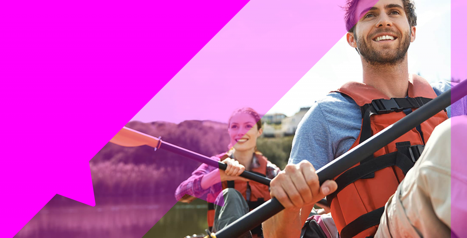
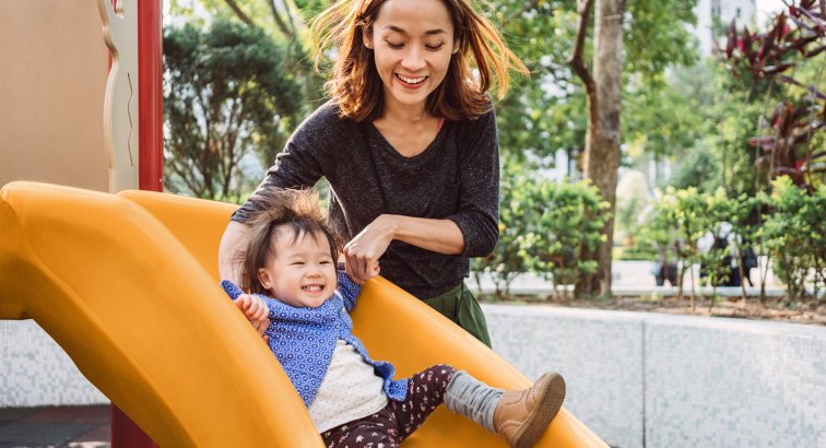
Large Header Image
The large header needs to account for the branding elements to the left side of the screen. Creative Services have templates to help position and size images properly, but you should keep in mind the final composition of the header when picking images. If the focus point or main content of your image is on the left, it will be covered by the header and mosaic. When looking for images, it is better to find those with the main focus of the image to the right side.
Also keep in mind that the image will appear differently at different sizes.
In the image below, the solid pink area represents the part of the image that will ALWAYS be covered. The shaded pink area represents the part of the image that will be covered in a smaller window/tablet browser.
Small Header Image
Similarly, the small header needs to account for the branding elements to the left side of the screen. Creative Services have templates to help position and size images properly, but you should keep in mind the final composition of the header when picking images. If the focus point or main content of your image is on the left, it will be covered by the header and mosaic. When looking for images, it is better to find those with the main focus of the image to the right side.
Also keep in mind that the image will appear differently at different sizes.
In the image below, the solid pink area represents the part of the image that will ALWAYS be covered. The shaded pink area represents the part of the image that will be covered in a smaller window/tablet browser.
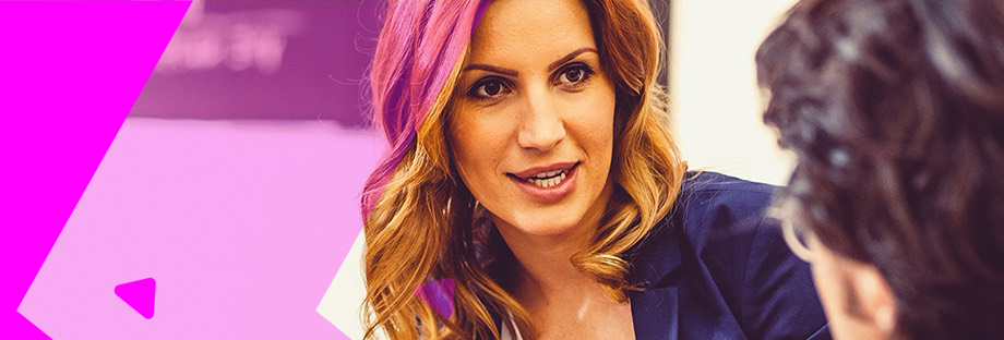
Image Card
Image cards present the image in a square. If you are using them, look for images that are either square already, or are focused on the center of the image. Note that the extreme right and left of the image will be cut out.
Image Card Cropping
In the image below, you can see how the image card has cropped the original picture to make it a square. You should choose images where the main focus of the composition are OUTSIDE the pink areas.
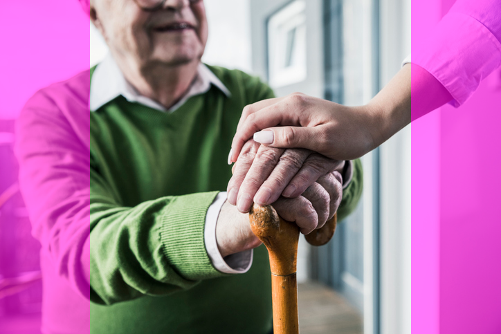
Image Blocks
Image Block modules are only available on a landing page but can take any size or shape image. For best results, look for an image with a 4:3 aspect ratio
Image Module
The image module presents images as a large rectangle. You should reserve this module for larger images only (particularly infographics, etc. or high quality photography.

Images in Tiles
The tiles module lets you display images above small blocks of text in a two or three column format. You should pick rectangular images for this module. It is also extremely important that your images are all the same size and aspect ratio (shape). You may need Creative Services to edit images accordingly even if the images have previously been uploaded to WordPress and used in other modules. Even small differences in image size will make your website look messy and unprofessional.

Title
Title
Lorem ipsum dolor sit amet, consectetur adipiscing elit, sed do eiusmod tempor incididunt ut labore et dolore magna aliqua. Ut enim ad minim veniam, quis nostrud exercitation ullamco laboris nisi ut aliquip ex ea commodo consequat. Duis aute irure dolor in reprehenderit in voluptate velit esse cillum dolore eu fugiat nulla pariatur. Excepteur sint occaecat cupidatat non proident, sunt in culpa qui officia deserunt mollit anim id est laborum.
Images in Free-Form Text Modules
You can also insert images into free-form text modules much in the same way that you add them to a Word doc or an email. You can use any size or type of image to do this although it is HIGHLY recommended that you only use smaller images inline with the text. If you wish to use a larger image, it is better to use the image modules listed above as it creates a more mobile-friendly website.
 “Lorem ipsum dolor sit amet, consectetur adipiscing elit, sed do eiusmod tempor incididunt ut labore et dolore magna aliqua. Ut enim ad minim veniam, quis nostrud exercitation ullamco laboris nisi ut aliquip ex ea commodo consequat. Duis aute irure dolor in reprehenderit in voluptate velit esse cillum dolore eu fugiat nulla pariatur. Excepteur sint occaecat cupidatat non proident, sunt in culpa qui officia deserunt mollit anim id est laborum.
Images in Columns

Image at the Top
You can add an image to the columns module by clicking the Add Media button. If you wish to mimic the look of the tiles module (but retain more space for text), add an image at the top of the column and then add the text below
Image Size/Mobile Responsiveness
If you are looking to add an image across the top – make sure that the image is set to ‘Full Size’. This may look very big in the editor window but will set the image to display the full width of the column and will rescale the image appropriately on mobile and small screens.


Small Inset Images
You can also add a small inset image (with or without the image above). To edit these, treat the column like a free-form text module. Note that this may need some adjusting/experimenting to get a good look in a mobile responsive environment and work best with very small images such as icons rather than inset photos.
Headshots
 If you are using the headshot feature within the ‘Profiles’ template it is important that you use square images. We currently upload 1043×1043 sized images. Other shaped images will not render correctly on the executive profiles master page and will have excessive white space on the profile page itself.