
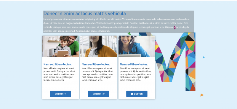
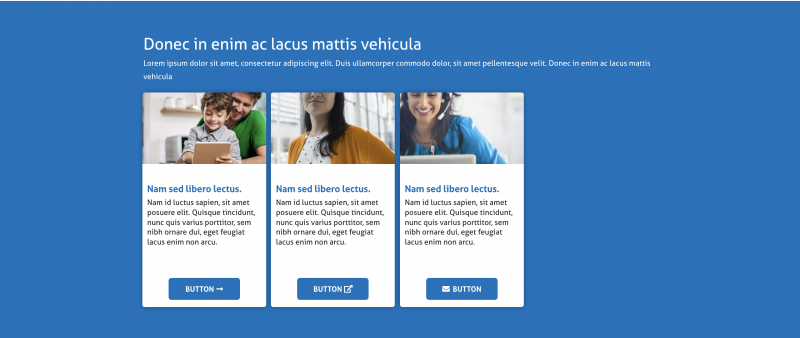
The Banner tool can be applied as either a Hero (page topper) or as a module within a page. It gives you a colorful and dynamic opportunity to host links, informations and calls to action. The Banner tool has a number of different options and variables that can be used in conjunction with each other.
Creating a Banner Hero
Banner can only be used as a hero on a Landing Page template.
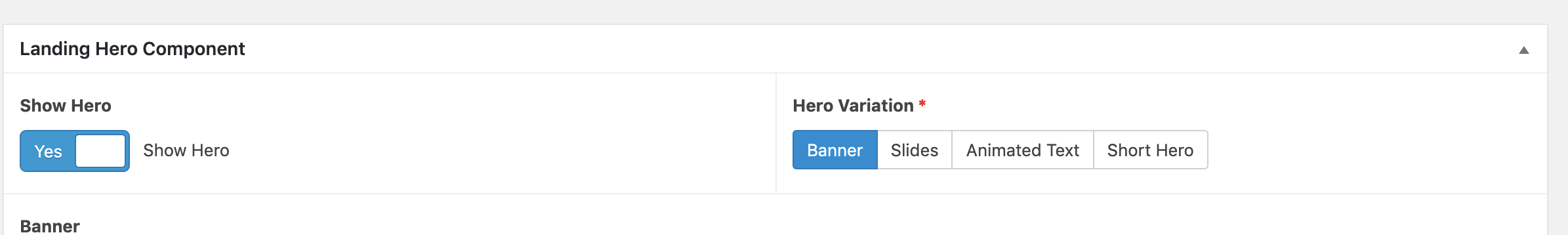
Click “Show Hero”and select “Banner” under “Hero Variation”
Add your H1 Copy (Usually the page or section title) to the Header Text box
Add Subheader text in the subheader box
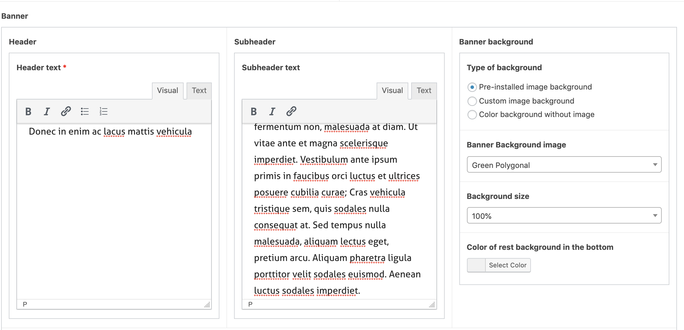
Select the Type of background you would like to use:
There are three options:
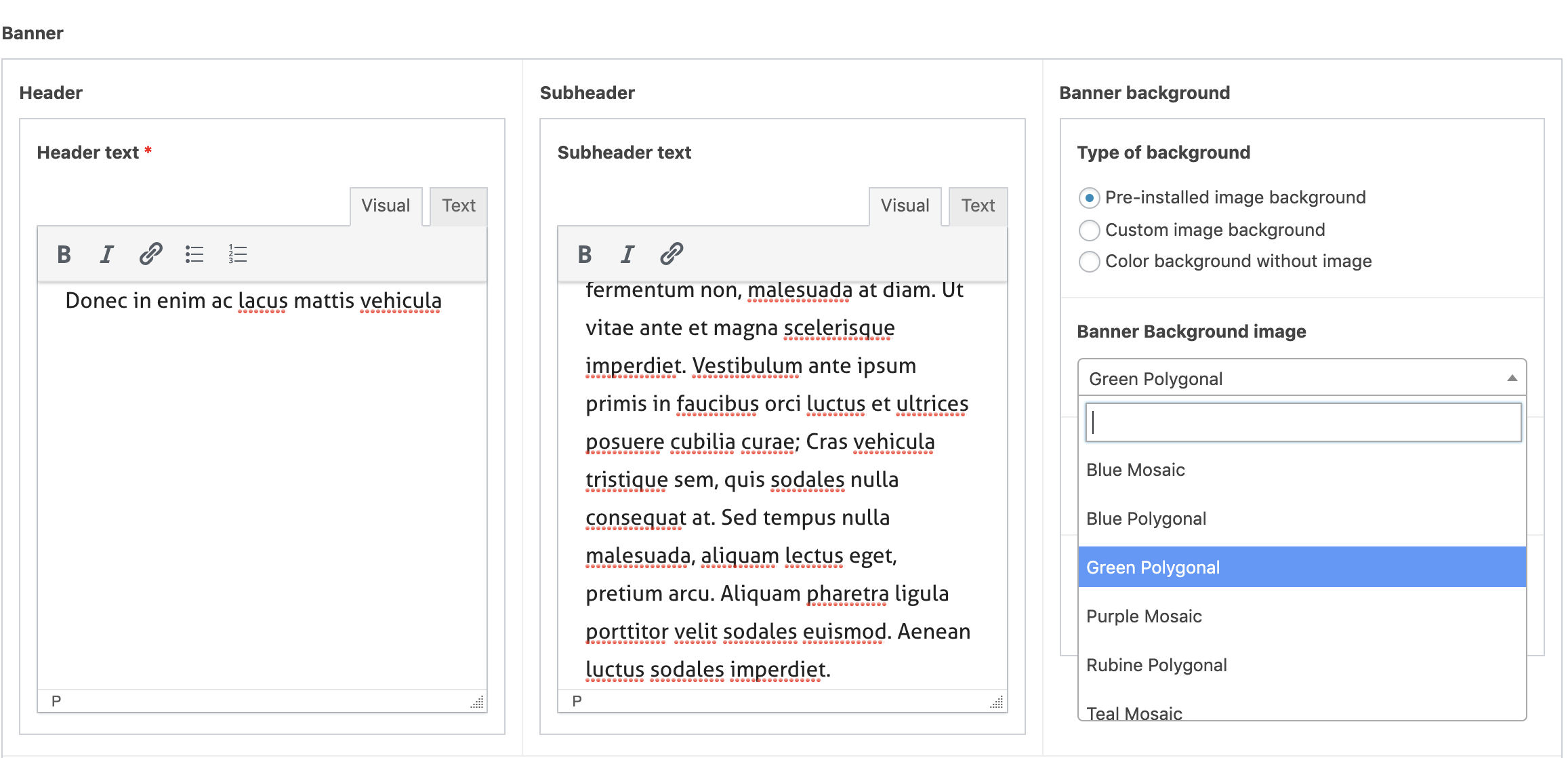
Pre-Installed
You can choose which preinstalled option you would like to use in the drop down
Uploaded Image
You can upload an image to go behind your cards by selecting “Custom Image Background” and then clicking “Add Image”. (This opens the usual media tool)
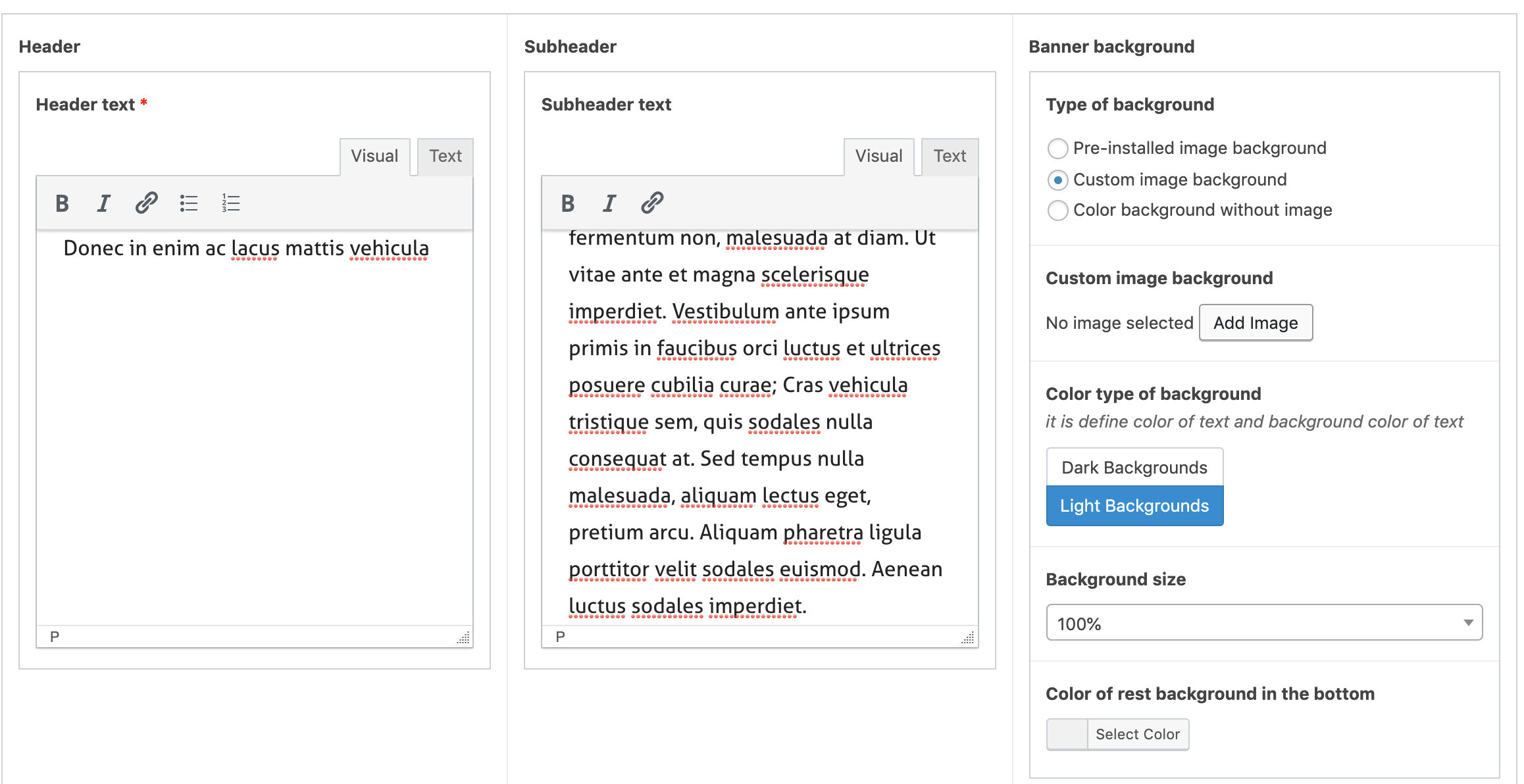
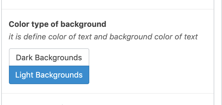
You can select ‘Dark backgrounds’ or ‘Light Background’ to ensure that the in your header and subheader remain accessible. We strongly recommend that on a custom image, this area is also left blank.
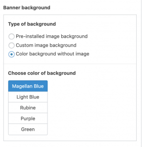
Solid Color
For a solid color background, ‘Color Background without image’. Then, choose your color from the list:
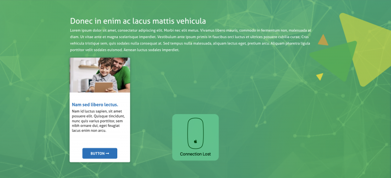
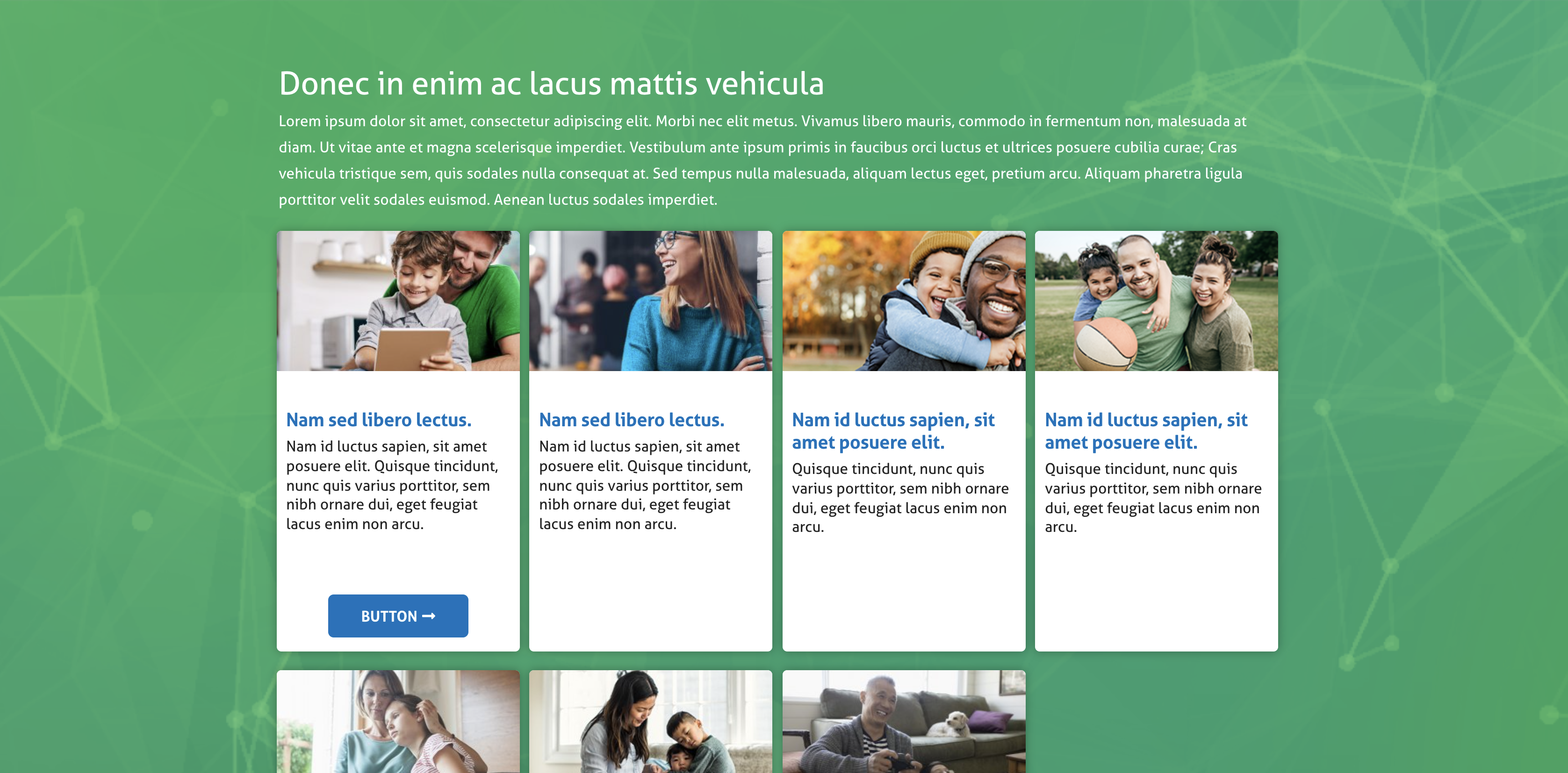
Adding Cards
You must include at least One Card for your banner. You can have up to four in a row and an unlimited number of rows. Note for those using the custom image option, that the more cards you have, the more your image will be blocked
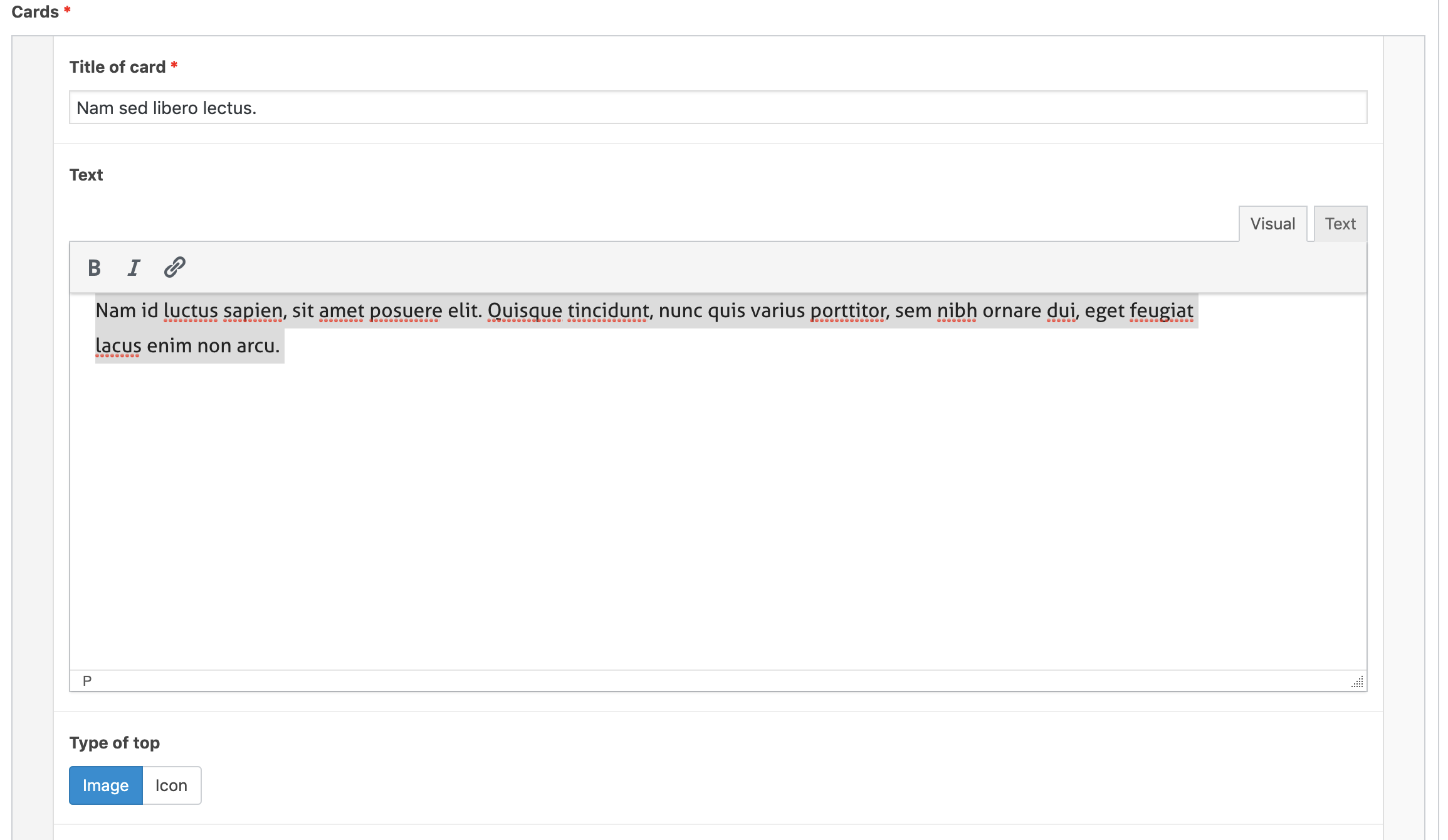
Add your card heading in the ‘Title of Card’ field
Add you card content in the ‘Text’ field
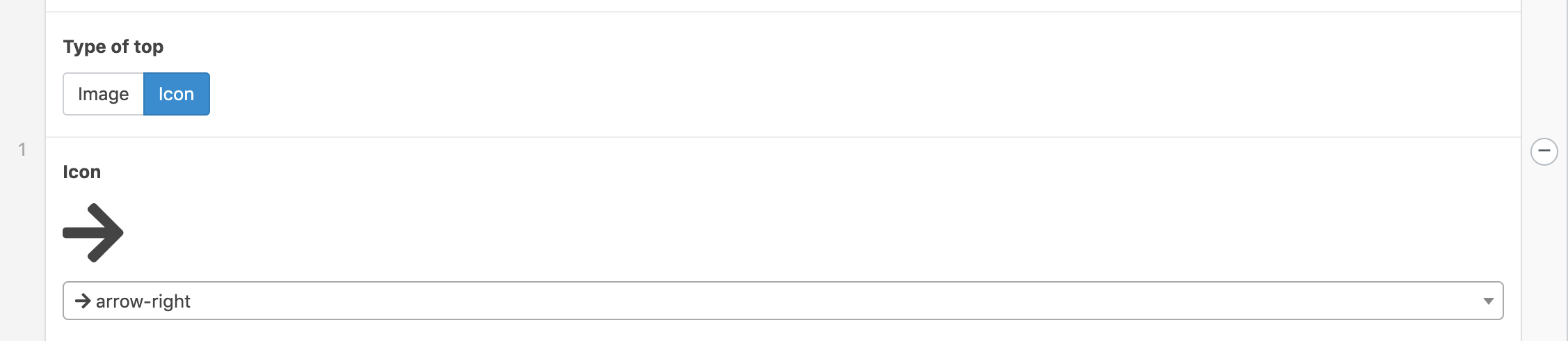
Add an image to the top of the card by choosing the ‘Image’ option and then clicking Add Media
You can also use a pre-installed icon by clicking Icon and choosing one of many options in the dropdown.
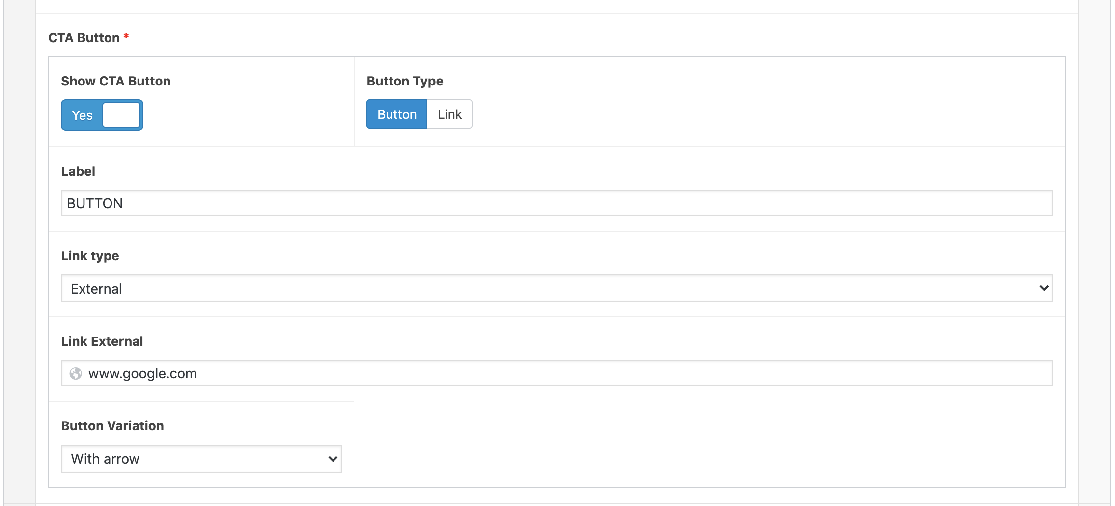
You can give your card a Call to Action in the form of a Button or Link.
To turn on the CTA click the ‘Show CTA Button’ and select if you want a Button or Text Link
Add a link as you would using any other module
Repeat adding cards until you have added all that you need.
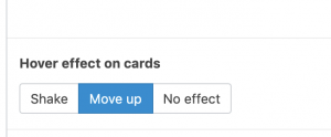
You can add or remove a small animation to your cards that occurs when the user moves a mouse over the card. Cards can jump up, shake or not move.
Managing Multiple Rows
If you have more that one row of cards, you can choose how the banner will integrate into the rest of the page.
Stretching the Background
If you would like the background to continue behind all of your cards, select ‘Cover’ in the background size option. Note that this works best with Solid Colors as it can cause the image to stretch.
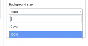

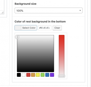
You can also choose to transition the background to a solid color. Select ‘100%’ in the ‘Background Size’ option. You can then choose the color you would like to transition to:
Creating a Hero Banner
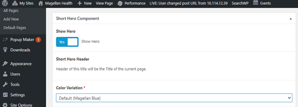
- First, click the slider at the top under “Show Hero” to say “yes.”
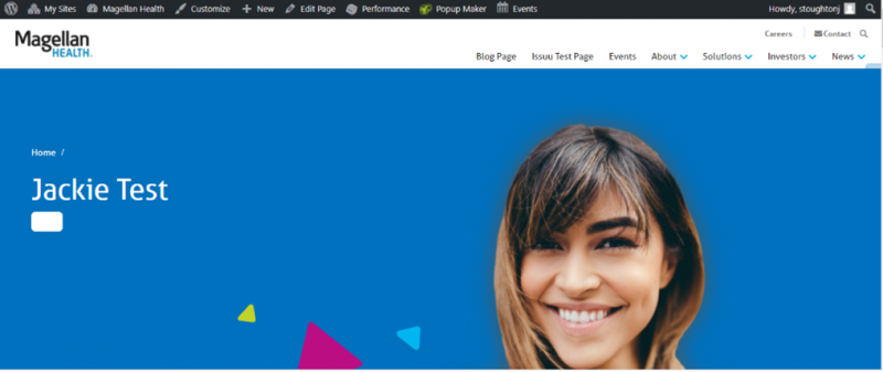
- Select a color variation. Options include default (Magellan Blue), Dark Blue, Rubine, Purple or Dark Green. This is the background color of the hero behind the title of the page displayed on the left side of the hero banner.
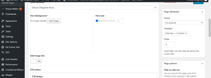
- Next, select an image as your hero background. This image will appear on the right side of the hero banner.
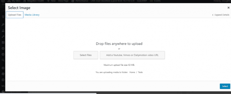
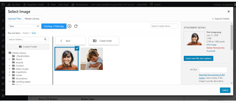
- Select an image by clicking “Add Image.” Then, select the appropriate image from the library, or upload your own by selecting the “Upload Files” tab on the top left corner.
- Click “Select” once you’ve chosen your image.
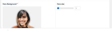
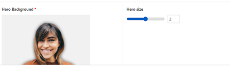
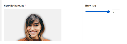
- Next, chose your hero size. Move the slider under “Hero size” to either 1 (small image), 2 (medium image) or 3 (large image).
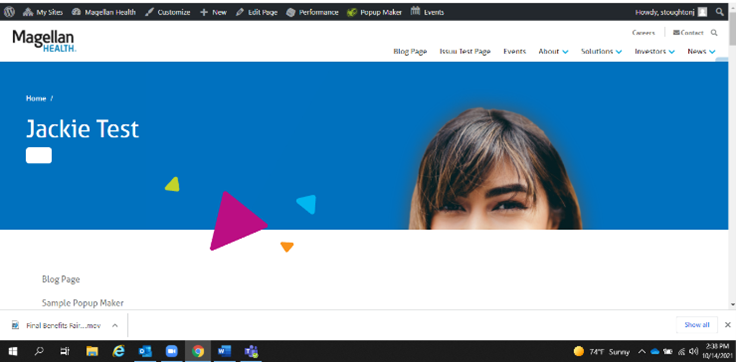
Size 1 (small):
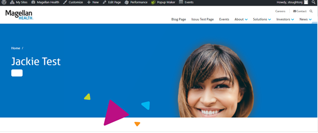
Size 2 (medium):
Size 3 (large):
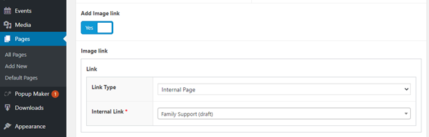
- If you want to add a link to the hero background image, switch the slider button under “Add Image link” to “Yes”
- In the box that appears below, select the link type. Either internal page, documents library item or external from the drop-down menu. Underneath that, either search for the internal page link or document or copy and paste in an external link.
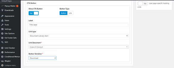
- If you want to add a CTA button to your hero background, switch the slider button to say “yes” underneath where it says, “Show CTA Button.” Next to that, select either “button” or “link” as your button type.
- Under “Label” type in the appropriate name of your call-to-action button. Under “Link type,” select the link type as either an internal page, document library item or external link for the drop-down menu. Below that, you will be asked to either search for the internal page or document you want to link to or copy and paste in an external link.
- Then chose a button variation from the drop-down menu.
- Once complete, click on “save draft” or “publish” located in the top right corner.